Using watercolor and photobashing technique to create good looking asset
Hi, every one! This is my second post on this blog.I dont want to make classical dev log. I wish my post will play more educational role. Check it next week for new portion of knwoladge if You want You can subscribe my newsletter : Newsletter – Crashed Creativity Studio
Today i will start with something simple. I think You can follow it even if you are not skillfull artist
First I have selected one of my watercolor. You can use your own artwork. You need just some background with interesting color stain.
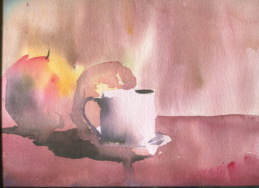
I have cut out some small part of it.
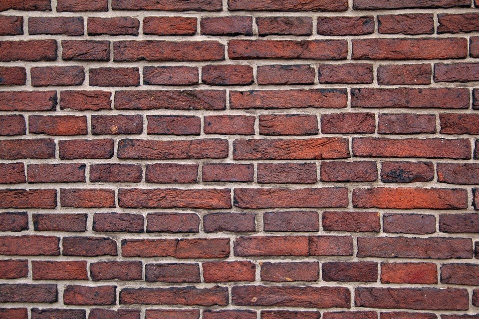
Next, find some photo of a wall with some bricks. You can use Niesamowite darmowe obrazy – Pixabay. Thay have royality free images.
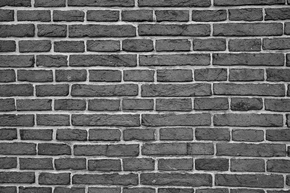
Next, desaturate it (Alt+Shift+ctrl+B).
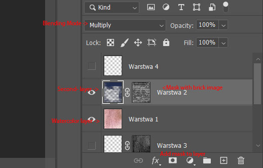
Then create new layer in watercolor picture with blending mode multiply. Add mask to this layer and paste this black and white image on this mask. You can resize it to cover all image
Then use some brush with pressure mappepd to transparency and paint on this layer (not on mask). Use some dark and cool collor This wil slowly discover brick’s spacing darkening orginal image.
Finally short Photooshop tools presentation:
That’s it, Remeber when you can stay with the same background for creating more than one asset. This will make consistency to your level look. Remeber of varying elemnet’s sizes. Few huge, more medium and most small to make good looking design.